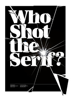
Ive been looking more at Clarendon and have come across other people researching it too. Here is a link to a blog with lots of into on it about the typeface. The main points are below.
'The Clarendon font appears to have started off as a design exercise to create a font that could highlight text within normal type. Apparently, until a certain point in history, this was almost always done by using italics, and Clarendon is nominally associated as the first 'related' bold face - as in it was designed to look nice along with standard Times fonts.
There other typefaces with a similar “look” appearing at earlier dates, the Clarendon font seems to be most appropriately associated with an origin date of 1845, and by a Robert Besley of Fann St. Foundary. Although, from general internet perusal, the circumstances are a little vague, it would appear that Besley went on to gain further fame in later years as a Mayor of London. He even went on to patent the font, although this particular hold lasted for only 3 years. But during this short time frame, the Clarendon font became very popular, and once the property hold was released, many a copycat font were produced much to the chagrin of Besley himself .
This particular font entered pop-culture history in terms of the type of font used in in certain noted environments. One being the wild western in North America (i.e. 'wanted' or 'reward' signs), and other, where Clarendon variants (specifically 'French Clarendon') took on a circus look (it’s even known as 'Circus Letters' in some texts).
it wasn’t until the 1920s when Clarendon, once again, experienced a resurgence of sorts, and like before, this was primarily due to pragmatic reasons. You see, at this point in history, newspaper production rocketed to new heights, and as a result, the printing technology became a lot more efficient as well as a lot faster and rigorous. However, a downside to this, was the fact that many of the type sets used were taking a physical beating resulting in the plates being damaged (especially when the lines were especially thin).
Consequently, a number of companies attempted to produce new fonts that would still look good, but could also function in the wear and tear realities of the new printing demands. Here, the Clarendon font stepped in.
Clarendon-like fonts experienced another boost during the 1950’s. This, just after the World War 2, coincided with a general increase in advertisement productions (the economic boom right after the war). Typography as a whole was caught in an intensive move to design new and innovative typefaces. This led to a large number of fonts which many feel fit within the Clarendon look. Including the current incarnation of the font, which was revised by Hermann Eidenbenz in 1953.'


